Fig. 09
cultural
Culturalee.
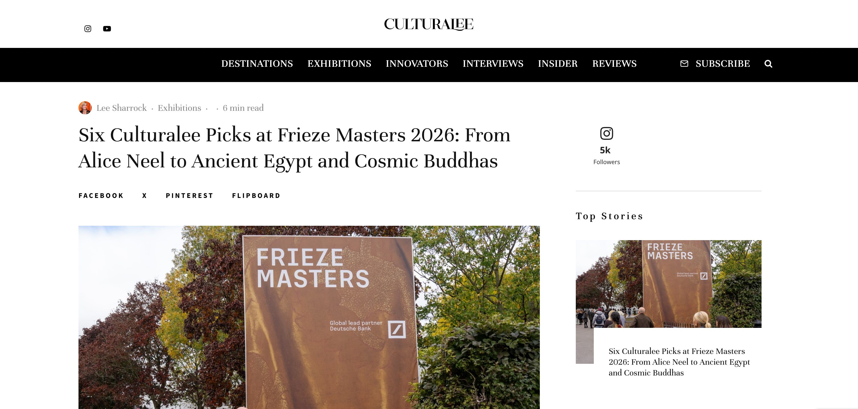
Identity, editorial and digital for a culture magazine covering destinations, exhibitions, innovators and interviews. The logo, the magazine and the register it publishes in.
Wall label
- Title
- Culturalee
- Medium
- [Stack, written like oil on canvas]
- Dimensions
- [Sections] · [Articles] · [Readers]
- Client
- Culturalee
- Role
- [Role, as agreed]
- Status
- Live · 2025
The problem
A culture magazine has to look like a magazine on a phone and read like one on a desk.
Most publishing templates do one or the other. The masthead, the section bar, the byline, the read time: each is a small decision, and together they decide whether a reader trusts the piece before the first sentence.
The work was identity, editorial and digital at once: the name on the masthead, the system the magazine publishes on, and the register it publishes in.
Built
8.1
The logo
The Culturalee wordmark, drawn for the masthead first and the favicon second. It has to survive a phone status bar and a printed tote.
8.2
The magazine
Masthead, section navigation, article page and story rails. One system that holds a Frieze report and a destination guide without changing register.
8.3
The reader
Subscribe, follow and share where a reader expects them, and nowhere else.
In their words
“Culturalee didn’t exist before Pour l’Art. We had a name and a point of view, and they built everything else from zero: a brand identity that holds up across web, print and social, a site that’s fast and reads beautifully on a phone, and SEO foundations that turned exhibition coverage into organic readers from the first months. They understood arts publishing from the inside, so we never had to explain why a review needs different treatment to a listing.”